Interface
Romain's requirement: simple, but with no compromise on the visual and aesthetic quality of the whole. Every remark of theirs on the interface is a decision: it goes here with its reason, in the same commit as the change.
Principles
- One gesture per screen. Each screen has one main action, which can be seen at once; the teacher repeats it thirty times with a pile of papers beside them.
- Paper and ink. A paper background, midnight blue ink for actions, and red, the colour of correction, kept for the microphone. Light or dark as the system is, both designed.
- "Vous" in French. A remark of Romain's: the French interface, the guide and the video's subtitles say "vous", never "tu".
- "Device", not "computer". A remark of Romain's: the tool runs on a phone as well as on a computer, so the interface and the guide say "device", and "computer" only for a real computer, as "Erase this device's data".
- A real finish. The Inter font, served with the site, never by a CDN; a player of our own rather than the browser's, which differs everywhere; French typography, with a non-breaking space before
:,?,!and;. - The same place from one step to the next. Steps of the recording keep the same height, so that the buttons do not jump under the finger.
- Calm movement. Short fades between steps, and none at all for those who ask their system to reduce motion.
Decisions
- The microphone shows that it hears: a clock and the level of the voice while recording, and a slow ring around the button, so that an open microphone cannot be forgotten.
- Listening back before sending: a memo is only sent on request.
- The QR code only on request: a remark of Romain's, showing it after sending clutters the view for nothing: what matters is the sheet of labels. A small link shows it, black on white in a white tile, in the dark theme too.
- Any order, and everything at the end: a remark of Romain's. A memo can be recorded and left unsent; the list tells what is left to send, and a button sends it all.
- Nothing lost by a wrong click: a remark of Romain's. A new recording is listened to next to the old one, which only goes once "Validate and replace the old recording" is chosen.
- Publishing in place: a remark of Romain's. Recording a memo again ends with "Publish in the same place", with under it, small and grey, "The QR code stays the same".
- No signing out: a remark of Romain's, there is no sign-in at all. Nextcloud is linked once. A discreet button erases this device's data, after a confirmation saying what stays and what is lost.
- The warning about links is always visible, never hidden behind a click, wherever a QR code is shown and on the page that generates the PDF (privacy).
- A reminder at the right moment: the recording screen says not to name the student, as memos are not encrypted on Nextcloud.
- An installable app, updating by itself, as Kolekti: a request of Romain's. The page reloads by itself when a new version is ready, except during a recording, a sending, a playback, a form begun or a pairing: a band then says that a new version is ready, that it will load once the work is done, and offers Reload at once.
- One frame around a field: a remark of Romain's, the keyboard focus outline came on top of the field's own frame, which was disturbing. It stays on buttons and links.
- Reusing a list, adding a student: a remark of Romain's. A student added to an assignment joins the next ones, not past ones, so that their count stays right.
- A spinner next to the name while sending: a remark of Romain's, it says more than a counter alone.
- Help, language and theme in one menu: a request of Romain's, three buttons would be a lot in a header that must stay calm, for things seldom used. A menu at the top right of every screen, three lines rather than ⋮, which is for what can be done to an assignment or a class. Help comes last, as is usual, and opens the guide in a new tab, so that a form begun or a recording stays as it is. The other language is named in that language. Until they are chosen, the theme is the system's and the language the browser's.
- The student's name on the label: a remark of Romain's, who prefers the 35 × 35. It tells which paper it goes on, and no sheet has to keep room for it. On the 35 × 35, a request of Romain's once his sheets came: a large QR code and the name on one small line, never two, first name first, centred under the code; a last name is cut with "…" only where 1.5 mm is left on a side.
- A QR code with no lines: a remark of Romain's, the lines between squares bothered the eye. It is drawn as one shape, on screen and in the PDF, as Kolekti's markers.
- Correcting and removing, out of the way: a request of Romain's. A ⋮ menu at the top of an assignment or a class, never on the recording screens: the main gesture stays alone. Every deletion says what goes and what stays first.
- A sheet already started, a label again: a request of Romain's, a class rarely fills a sheet. The first free label is touched on a drawing of the sheet, and the labels to print are ticked, both folded by default.
- A limit explains itself: a request of Romain's. On a limit of the relay, the page says what to do rather than giving an error code.
- Adding, merging, cutting, without leaving the page's logic: a request of Romain's. A recording added is listened to next to the other, as a new one always was; merging comes first when it was asked for. Cutting is done with two handles on a drawing of the sound, the passage in red, as the microphone. Nothing changes until "Keep this version".
- A device lost, in three steps: a request of Romain's. A discreet link on the home page leads to a page saying what to do in order, and honest about what cannot be taken back.
- Printing before marking, offered where one prints: a request of Romain's. The labels page offers to prepare the QR codes of those who have none, and says what the student hears until then. The list keeps counting only real memos, with a discreet "QR code ready", so that nothing looks done.
- Accompanying the choice of one QR code for the year: a request of Romain's, who wants the teacher told what it costs. Choosing it opens what it gives, what it costs and what to do if a QR code is stolen, with a box to tick; cancelling leaves things as they were. The class page and the student's page then keep saying what to do with a stolen QR code, and making a new one is offered in its place, with its label.
- Scanning Nextcloud's QR code on a phone: a remark of Romain's, typing a long password on a phone is a pain. The button only shows on a touch screen, on the screen that links Nextcloud; the camera is only asked for when it is touched, and a code of another server is refused.
- Saying what this is before asking for anything: a remark of Romain's, opening on a request for a login was abrupt. The first screen says who the tool is for, what it does and where the recordings go, for someone who knows nothing of it, explaining its words and fixing neither the length nor the nature of the message, with a link to the guide and a Start button; the login comes next.
- No length or kind of message imposed: a remark of Romain's, a memo may be a piece of advice or a full comment, and does not have to replace anything: no text says "a few sentences" or "short".
- An imported list shows only the names: a request of Romain's, a Pronote export has many columns. The field's hint says that it is accepted; the field shows the names found, to be reread, and never the rest of the file.
- Where to find the login, on request: a remark of Romain's, a path to follow written above the form did not read well. A button, "Where to find my Nextcloud login?", opens the steps in a pop-up, over the form, so that what was typed stays, with a link to the guide.
- Never the ENT's password: a request of Romain's. A warning always visible above the fields says not to type the ENT's login and password, and the refusal message says it again, as it is the likeliest mistake.
- Listening in the app: a remark of Romain's, being sent to Nextcloud to listen was unpleasant. Listen plays the memo here; Test the link, by the QR code, opens it as the student will.
- A memo sent, without too many buttons: a remark of Romain's, the page had too many. A large round play button, the sound fetched from Nextcloud only when it is pressed, then its player; the QR code as a button with an eye, crossed out while it is hidden; redo, add and cut together under Edit.
- Deleting a memo: a question of Romain's, it was not possible. Delete this memo, last under Edit, in red, after a confirmation. Deleting never breaks a printed QR code (Romain): the memo becomes two tones again, as before recording, over the same file and link; only a private memo, with no link, loses its file.
- Recordings not sent, seen at once: a request of Romain's, it is what matters. On the home page, "2 to send" on the assignment; on its page, a cloud with an arrow up, orange, after its title, the microphone staying before the students; the same cloud on Send the 2 memos.
- From one student to the next: a request of Romain's, to listen to memos one by one without going back to the list. Arrows at the top of a student's page, previous and next in the list's order; the arrow on the left goes back to the list.
- Other devices' work without reloading: a remark of Romain's. The backup is looked at every minute while the tool is in view: what another device did is offered, "Another device changed your data", and only taken in on Fetch, never unasked; recordings not sent stay as they are. A small ⟳ next to the save state fetches at once.
- The save state never moves the card: a remark of Romain's, the card jumped each time the line under it changed. That line always keeps its place, two lines high, even empty or wrapped on a phone.
- Deleting, said without the two tones: a remark of Romain's, "two tones" was unclear (a note is also a mark): the confirmation says "The memo is erased, but its QR code stays valid: it waits for a new memo."
- What a QR code ready waits for, said plainly: a remark of Romain's, "this memo will come behind it" was unclear: "it will play this memo once it is sent".
- The message about another device, a tinted band: Romain's choice among four, seen in real screenshots. At the bottom of the screen, tinted blue as the notes of the pages, in the theme's colours, rather than Vuetify's inverted dark band.
- Tips where they tell something, in a few words: a request of Romain's, who found them too long: the essential, not everything ("Check your adjustment against the light"). On the buttons that are only an icon (menu, ⋮, arrows, ⟳, the password's eye, a student's pencil and cross) and on the states of a paper (to send, to validate, QR code ready, online), never on a button whose words already say it; on the labels page, what each setting measures and how to use the check sheet. Never over the menu a button opened. In the theme's colours, as the band of the other devices, not the browser's; only where a pointer hovers, as a tap would leave them open on a touch screen.
- No tip after a tap, even on a computer with a touch screen: a remark of Romain's, on a touch PC a tap on Back left the tip over the next card's button. Tips only open while the mouse is what was used last; it brings them back as soon as it moves.
- A personal or a shared device, and a local password: a worry of Romain's, a teacher leaving their Nextcloud access on a shared browser. Asked at sign-in and pairing, with no answer given: Personal, or Shared, as in the staff room, where nothing is written on the device (not even the session storage, which "restore the previous session" gives back) and 30 minutes without activity forget everything, unless recordings are not sent. On a personal device, an optional local password of 8 characters at least, asked at opening and after 30 minutes; forgotten, the device is erased and paired again. All of it in This device, in the menu, with how to revoke the access in Nextcloud. No form any more for the passwords: a browser offers to keep what a form sends.
- What erasing the key loses, said each time: a request of Romain's, forgetting the local password erased everything without saying so. Corico keeps no list of the paired devices, so wherever the key goes (forgotten password, erasing this device, a shared device), a warning in orange says that if no other device is paired with the account, everything is lost for good: assignments, class lists, links between students and memos; memos sent and printed QR codes stay. Not when pairing: another device has the key.
- One order on every device: a remark of Romain's, the assignments came in another order on the phone. The newest first, by when it was made, on every device; those made before the date was kept, by title.
- One title per assignment in a class: a remark of Romain's, two assignments of the same name could not be told apart. Creating or renaming one refuses it, saying why.
- Memos tidied in folders: a request of Romain's, memos side by side in one folder were hard to find. A folder per class and, in it, one per assignment, named after them; renaming moves the folder; the memos sent before are tidied in. Two classes cannot share a name.
- The same gap between all the home buttons: a remark of Romain's, on a phone Install the app touched Pair another device. Every button of the home page stands 8 px from the next, the install one too.
- Nothing past the edge on a phone: a remark of Romain's, with a large text size the merge order and the sign-in buttons went past the edge. A full-width button goes on two lines if need be; the merge order's two choices take half the width each.
- The pairing code types itself into shape: a request of Romain's. One field, in capitals, the dash put in by itself after the fourth character.
- The name: a remark of Romain's, the provisional name did not appeal. Corico, "corriger des copies" and the rooster's "cocorico", the voice of the teacher's marking, playful on purpose; the tagline stays "Spoken feedback on papers" (in French, "La correction qui parle"). The reasons, the names set aside and the other uses of the name: Name and visual identity.
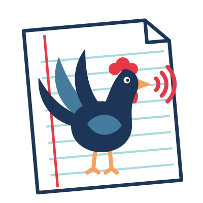
- The logo: Romain's choice among three. A rooster that speaks, sound waves out of its beak, standing on a student's paper, in colour; for the tab and the installed app, the rooster alone, which can still be told at 16 px. Rather large in the header, 52 px in the app and 44 px in the documentation (Romain): smaller, the paper could hardly be seen. Never next to the QR code on the papers. The name beside it in Fredoka, round and friendly as the rooster, served by the page itself (Name and visual identity).