Name and visual identity
Chosen with Romain in November 2026. The reference files are in brand/ at the root of the repository: svg/ for the drawings, font/ for the font, sources/ for the Python scripts that first drew them.
The name: Corico
The provisional name did not appeal. Other ideas were weighed: Margo, Annota, Écho, Retour Voix, Copivoix, Koriko.
Corico was kept, spelt with Cs:
- it sounds like "corriger des copies", marking papers;
- it recalls "cocorico", the French rooster's cry, so the voice: the teacher speaks their marking;
- its playful tone is wanted;
- it gives a logo easy to picture: a rooster.
Spelt with Ks, Koriko sounded like a brand of cereals, and lost the link with "correction" and "copie".
The tagline stays: "Spoken feedback on papers" (in French, "La correction qui parle").
Other uses of the name
A quick web search (not a trademark search) found the name already used by data analysis software (CORICO, "iconography of correlations"), by SportCorico, an app for football clubs, and by a food company. It does not matter here: the tool is not sold, lives on a personal subdomain, corico.infobrisson.fr, and spreads by word of mouth to a few teachers. The question would come back only with a wide spread or a release in the app stores.
The logo
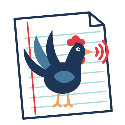
A rooster that speaks, small sound waves coming out of its beak, standing on a student's paper: a ruled sheet with a red margin and a folded corner.
Three versions were drawn: A, colour, B, outline only, for black and white printing, and C, icon, a white rooster on a rounded red square. A was kept, its colours as they were.
The logo never goes next to the QR code on the papers. An explicit choice: the label is the student's, it carries the QR code and the name, nothing else.
Colours
| Role | Colour |
|---|---|
| Rooster's body, text, paper's edge | #1d3557 (navy) |
| Secondary feathers, wing | #457b9d (blue) |
| Comb, wattle, waves, paper's margin | #e63946 (red) |
| Beak, legs | #f4a261 (orange) |
| Paper's lines | #a8dadc (light blue) |
| Paper | #ffffff |
The red stays the colour of correction and of the microphone in the app (interface).
The small icon
For the browser tab and the installed app, a simpler drawing: the rooster alone, without the paper, cropped as large as it goes. The paper could no longer be read at that size. Fewer feathers, two waves instead of three, thicker lines. At 16 px it is still a rooster: a dark shape, a red comb and the waves. On the phone's home screen, it stands on white.
The name next to the logo
In the header of the app and of the documentation, the logo, then "Corico" in Fredoka SemiBold (600). Four fonts were compared: Fredoka, Baloo 2, Nunito and Lexend; Fredoka for its round, friendly shapes, which go with the rooster's playful tone. In navy, as the logo; light on a dark theme. The rest of the text stays in Inter.
Fredoka is under the SIL Open Font License. The page serves it itself, as everything else: only the letters of the name, a file of 1.5 kB, with its licence (fredoka-OFL.txt). No font is fetched from Google: the privacy page promises no third-party service.